Gentrification Analysis in Marion County: A Data-Driven Approach
Exploring neighborhood changes through visualizations and data analysis to
quantify socioeconomic transformations from 2017 to 2022.
Introduction
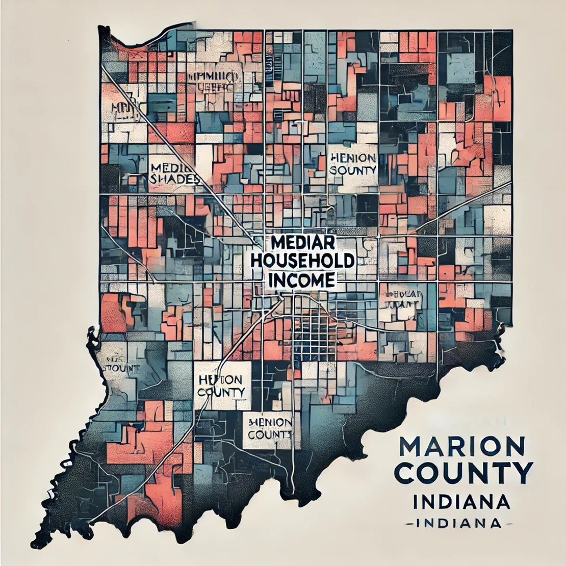
The gentrification analysis of Marion County focuses on understanding neighborhood transformations by examining key metrics such as income, education, housing, and diversity. Gentrification often signifies the socioeconomic evolution of urban areas, with significant implications for community dynamics and policy interventions. By leveraging public datasets and advanced visualization techniques, this project provides insights into the trends shaping Marion County neighborhoods over time.
Objective
To analyze and visualize neighborhood changes in Marion County, with an emphasis on the following objectives:
- Identify trends in median household income, education levels, and housing patterns.
- Evaluate gentrification dynamics across census tracts from 2017 to 2022.
- Create actionable visualizations for policymakers and researchers to understand socioeconomic disparities and opportunities.

Methodology

Data Collection
Datasets were sourced from publicly available Census Bureau records and geo-referenced data (GeoJSON files). Metrics such as income, education, and housing were extracted for analysis.

Data Preparation
The data was cleaned, missing values were addressed, and tract identifiers were standardized for consistency. Variables were formatted for compatibility with both static and interactive visualization tools.

Visualization Techniques
Heatmaps, choropleth maps, and scatter plots were created to visualize temporal and spatial patterns. Radar charts and density plots were used for holistic and detailed analysis.
Workflow
Data Sourcing:
Extract data from census and GeoJSON sources.
Data Preprocessing:
Handle missing values, merge data, and prepare tract identifiers.
Statistical Analysis:
Calculate metrics such as income growth, educational attainment, and rent burden.
Visualization:
Create interactive and static visualizations for exploratory analysis.
Results
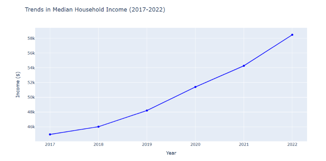
Median Household Income Trends
Inferences
- Median household income in Marion County has shown a steady increase from 2017 to 2022, reflecting an upward economic trend.
- The growth rate in income appears to accelerate significantly after 2020, indicating possible shifts in economic dynamics.
- This consistent rise in income levels could contribute to gentrification patterns, impacting housing affordability and demographic changes.
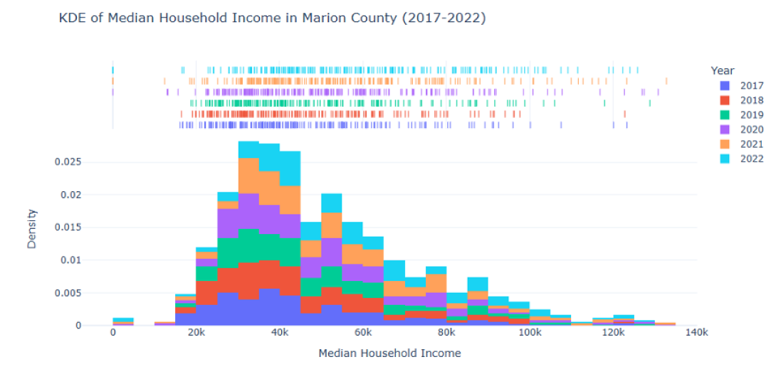
KDE Visualization of Median Household Income in Marion County (2017-2022)
Inferences
- The distribution of median household income has shifted to the right over the years, indicating an overall increase in income levels from 2017 to 2022.
- The density peaks are sharper and more distinct in later years, suggesting a concentration of incomes around higher values.
- Variability in income appears to decrease slightly over time, with fewer extreme low-income and high-income outliers observed in recent years.
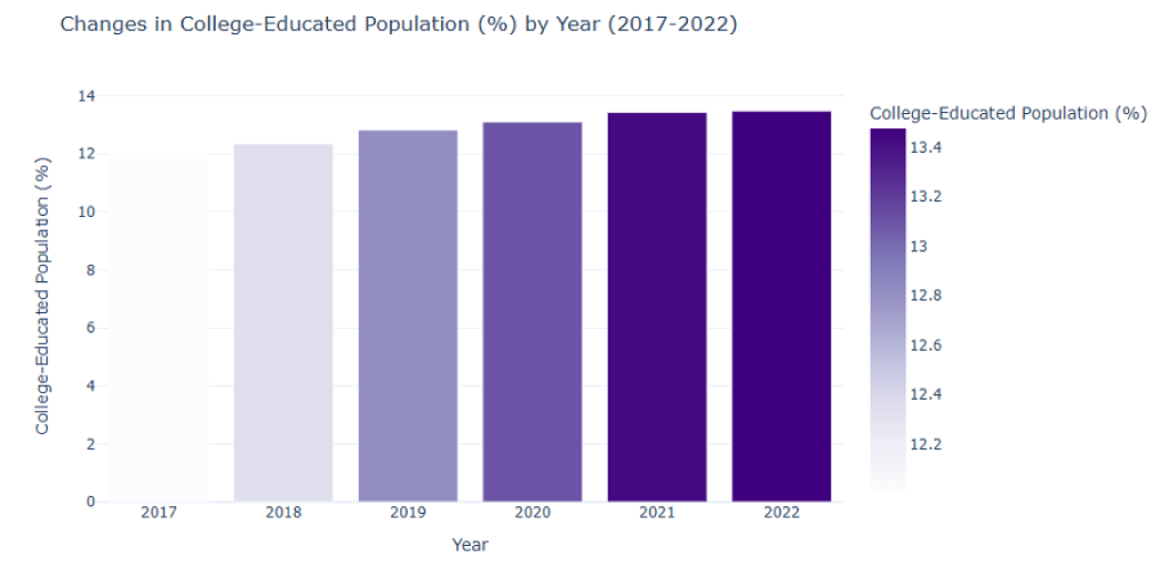
Trends in College-Educated Population Percentage (2017-2022)
Inferences
- Steady Increase: The percentage of the college-educated population in Marion County has consistently increased from 2017 to 2022, suggesting ongoing improvements in educational attainment over time.
- Saturation Point: The growth rate appears to slow down in the later years (2020-2022), potentially indicating a levelling off or saturation in the college-educated demographic.
- Impact on Gentrification: A rising proportion of college-educated residents may correlate with socioeconomic shifts, contributing to gentrification patterns through increased income levels and housing demand.
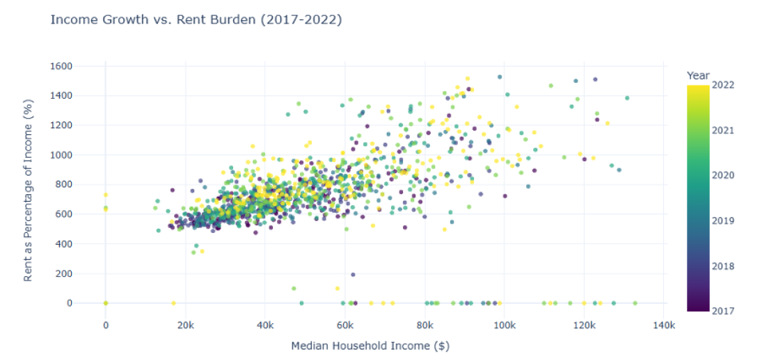
Income Growth vs. Rent Burden (2017-2022)
Inferences
- Positive Correlation: The scatter plot shows a positive correlation between median household income and rent as a percentage of income, indicating that higher-income households often face a proportionally higher rent burden.
- Yearly Patterns: Data points are distinctly clustered by year, with more significant variations observed in recent years (2020-2022), suggesting evolving economic dynamics.
- Outliers: Certain households exhibit extreme rent burdens (over 1000% of income), potentially reflecting housing affordability crises or data anomalies.
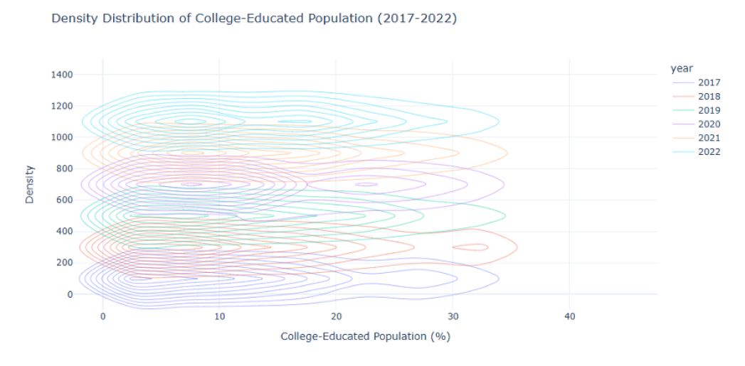
Interactive Density Distribution of College-Educated Population (2017-2022)
Inferences
- Dynamic Density Visualization: The interactive contour plot highlights yearly differences in the density distribution of the college-educated population, making it easier to identify trends and overlaps.
- Consistent Increase: The contours shift toward higher percentages over time, indicating an increase in the share of college-educated individuals across the county.
- Yearly Variations: Earlier years (2017-2019) show wider spread contours, reflecting more variability, while later years demonstrate a more concentrated distribution.
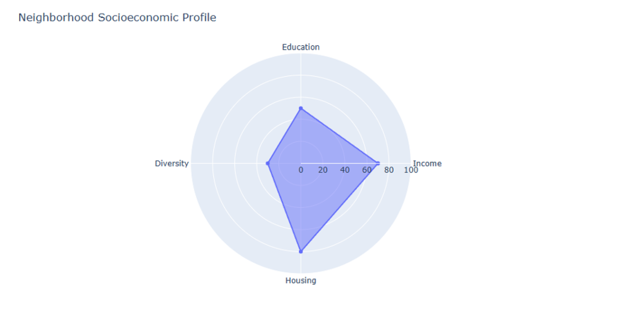
Interactive Neighborhood Socioeconomic Profile Radar Chart
Inferences
- Holistic View: The radar chart provides a clear visualization of the neighborhood’s socioeconomic characteristics across multiple dimensions, helping to identify key strengths and weaknesses.
- Strong Housing and Income Metrics: The neighborhood scores highest in housing (80%) and income (70%), indicating relative advantages in these areas.
- Areas for Improvement: Education (50%) and diversity (30%) are comparatively lower, suggesting potential areas for policy focus or community development.
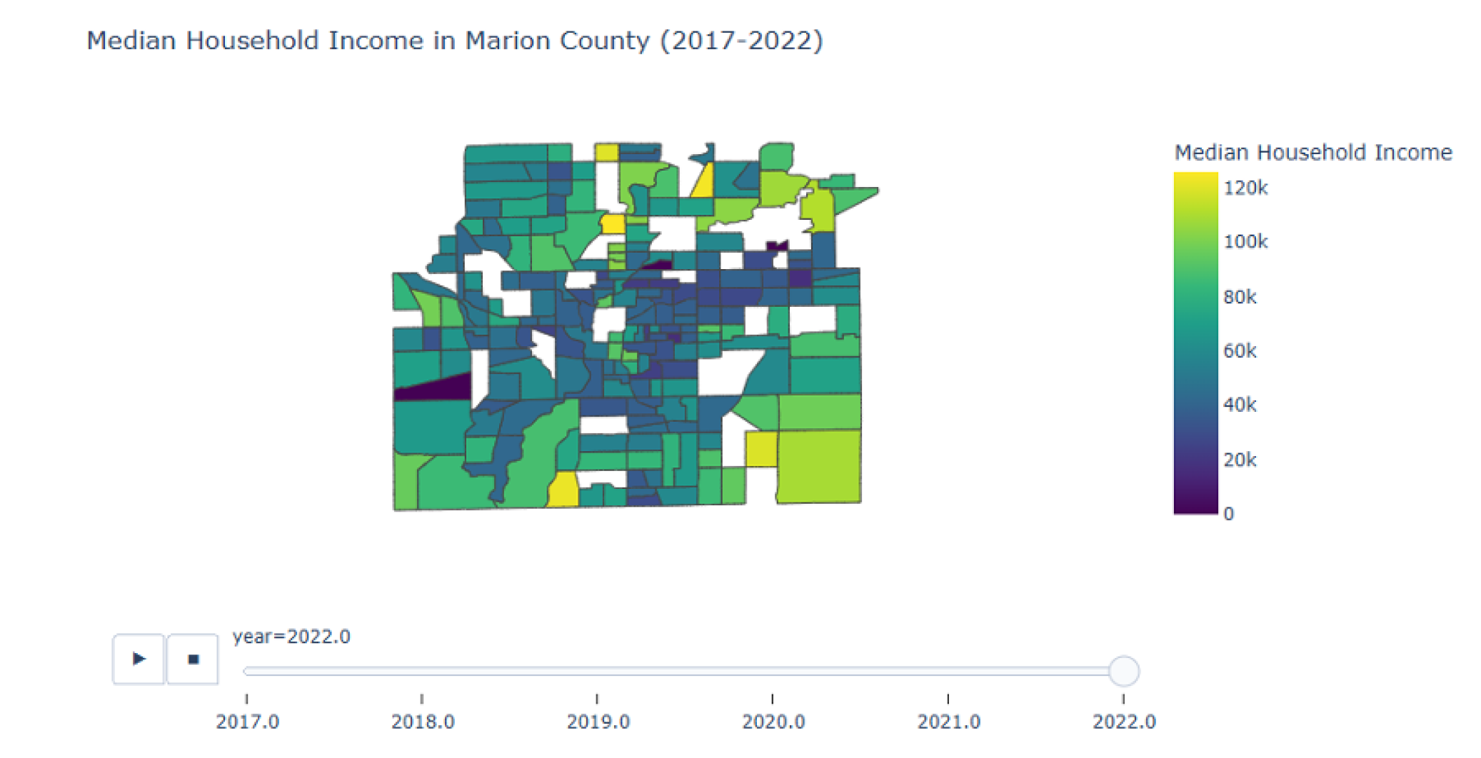
Median Household Income in Marion County (2017-2022): Animated Choropleth Map
Inferences
- Spatial Economic Growth: The map demonstrates a noticeable increase in median household income in specific tracts of Marion County from 2017 to 2022, emphasizing areas of rapid economic development.
- Geographic Disparities: Income distribution is uneven, with some regions consistently outperforming others, indicating significant economic inequality across the county.
- Emerging High-Income Areas: Certain census tracts transition to higher income brackets over time, potentially signifying gentrification or targeted economic investment.
Yearly Change in Median Household Income by Census Tract
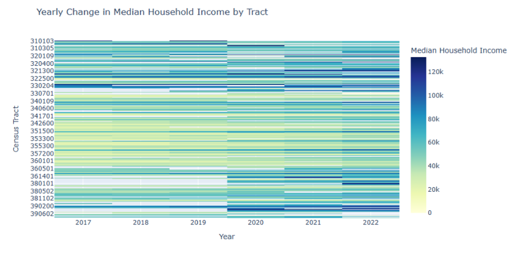
Inferences
- Temporal Variability: The heatmap reveals significant variations in median household income across census tracts over the years, with some tracts consistently showing higher incomes.
- High-Income Clusters: Certain tracts stand out with consistently high median household incomes (dark blue regions), indicating economically thriving areas.
- Dynamic Shifts: Over time, gradual shifts in the color intensity highlight economic growth or stagnation in specific tracts, offering insights into regional income trends.

Conclusion
The analysis highlights clear patterns of gentrification in Marion County, with specific census tracts showing rapid economic and educational growth. While these trends reflect positive socioeconomic changes, they also underscore challenges related to affordability and inclusivity. By visualizing these dynamics, this project provides a foundation for policymakers to address disparities and support equitable urban development.
Team Members
| Name | Role |
|---|---|
| Hasaranga Jayathilake | Lead Data Analyst |
| Supraja Pericherla | Lead Data Analyst |
| Shreya Reddy Kunchala | Data Analyst |
| Varsha Reddy Madireddy | Data Analyst |
| Amirta Varshini Natarajan | UI/UX Designer |
| Narasimha Rohit Katta | Web Developer |
| Vahini Matlakunta | Project Manager |