Introduction:
Data visualization has become a cornerstone of data-driven decision-making, providing a clear and concise way to interpret complex datasets. The Polis Center aims to strengthen its capabilities by developing an in-house visualization mechanism that prioritizes intellectual property security, accessibility, and ease of use. This initiative will enable the Polis Center to maintain ownership and control of its datasets while empowering individuals with varying levels of technical proficiency to create impactful visualizations.
Objectives:
- Data Intellectual Property Security: Develop a robust in-house data visualization mechanism to ensure full ownership and security of datasets, safeguarding them against unauthorized access and external dependencies.
- Ease of Use for Non-Technical Users: Create a user-friendly software solution that enables individuals with limited technological expertise to easily create data visualizations without requiring advanced technical skills.
- Enhanced Accessibility: Ensure the tool is accessible to a wide audience, democratizing data visualization capabilities for everyone, regardless of their background in technology.
- Empowering Decision-Making: Facilitate the creation of insightful visualizations that enable informed decision-making for internal and external stakeholders of the Polis Center.
- Customizable and Scalable Solution: Build a scalable software system that can be customized to meet the evolving needs of the Polis Center and its users.
This initiative will position the Polis Center as a leader in data visualization innovation while upholding the values of accessibility and intellectual property security.
Methodology
To develop the in-house data visualization mechanism for the Polis Center, the following systematic approach was undertaken:
- Initial Research: The project began with a comprehensive exploration of existing tools and processes. This research aimed to understand the current landscape of data visualization mechanisms and identify key gaps and opportunities for improvement.
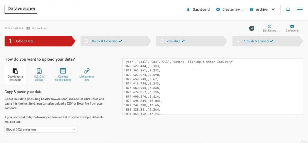
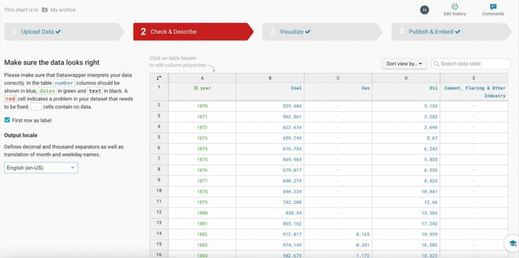
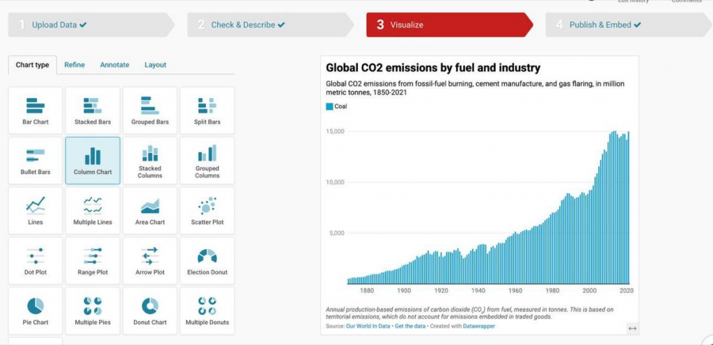
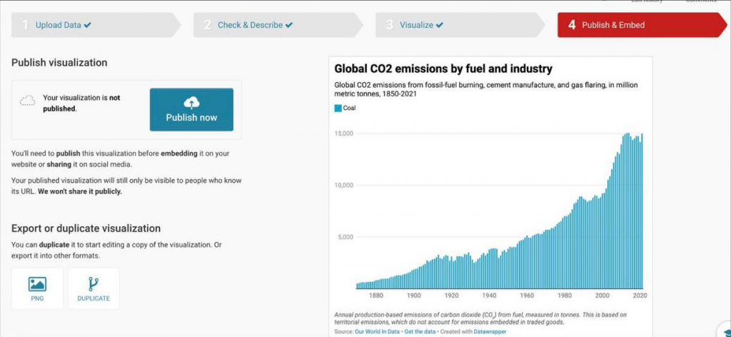
- Heuristic Evaluations: Evaluations were conducted on the existing Polis website and the Datawrapper platform to gain insights into their usability, functionality, and visualization creation processes. This step helped identify strengths, weaknesses, and user pain points in the existing systems.
- Brainstorming Sessions: Collaborative brainstorming sessions were held to explore ideas and solutions based on the insights gathered. These sessions facilitated the generation of innovative concepts to address identified challenges and align with project objectives.
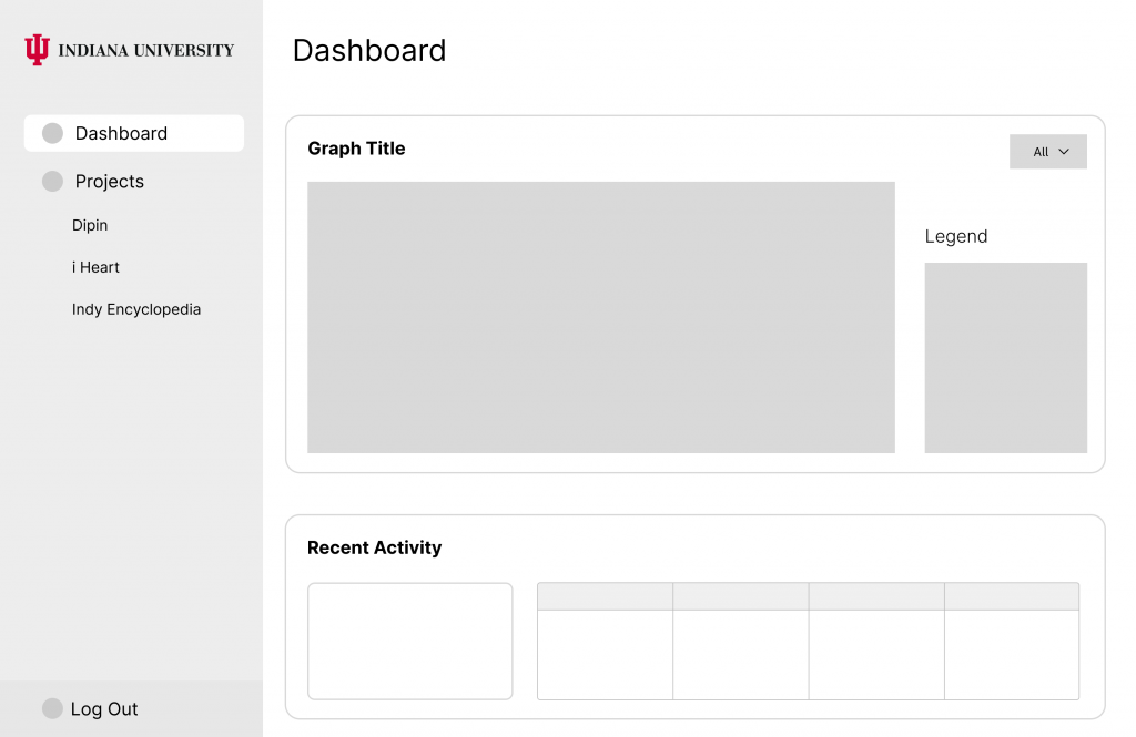
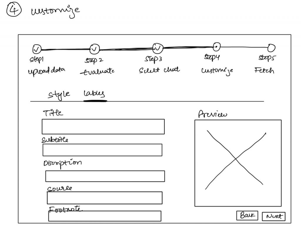
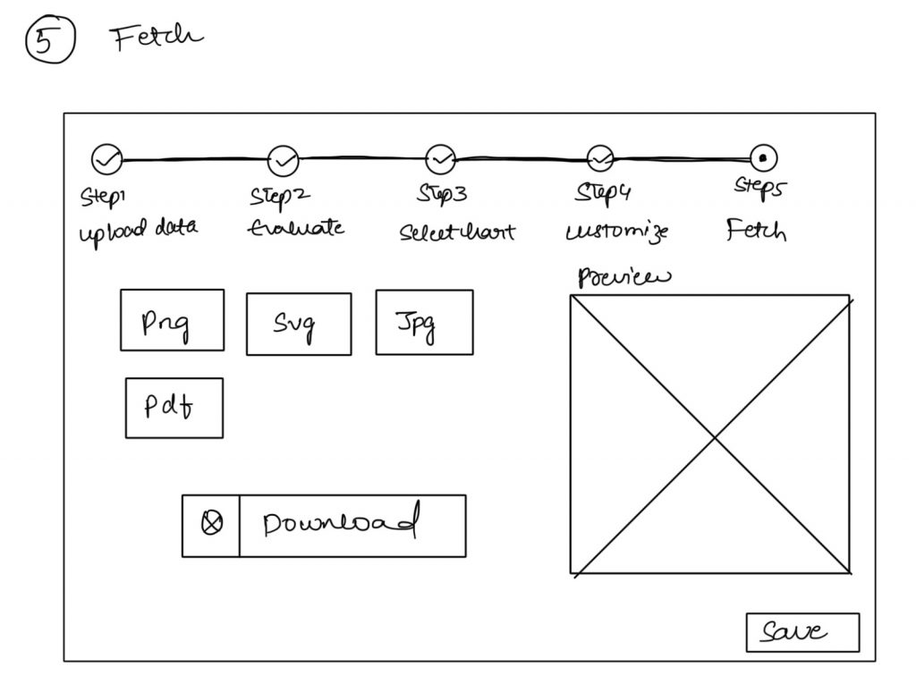
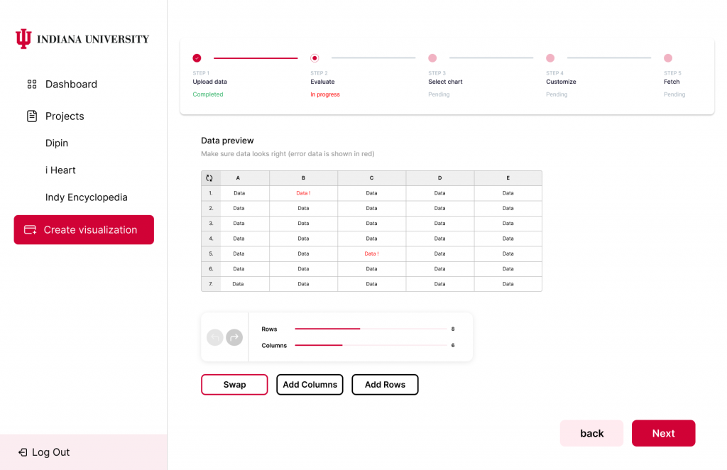
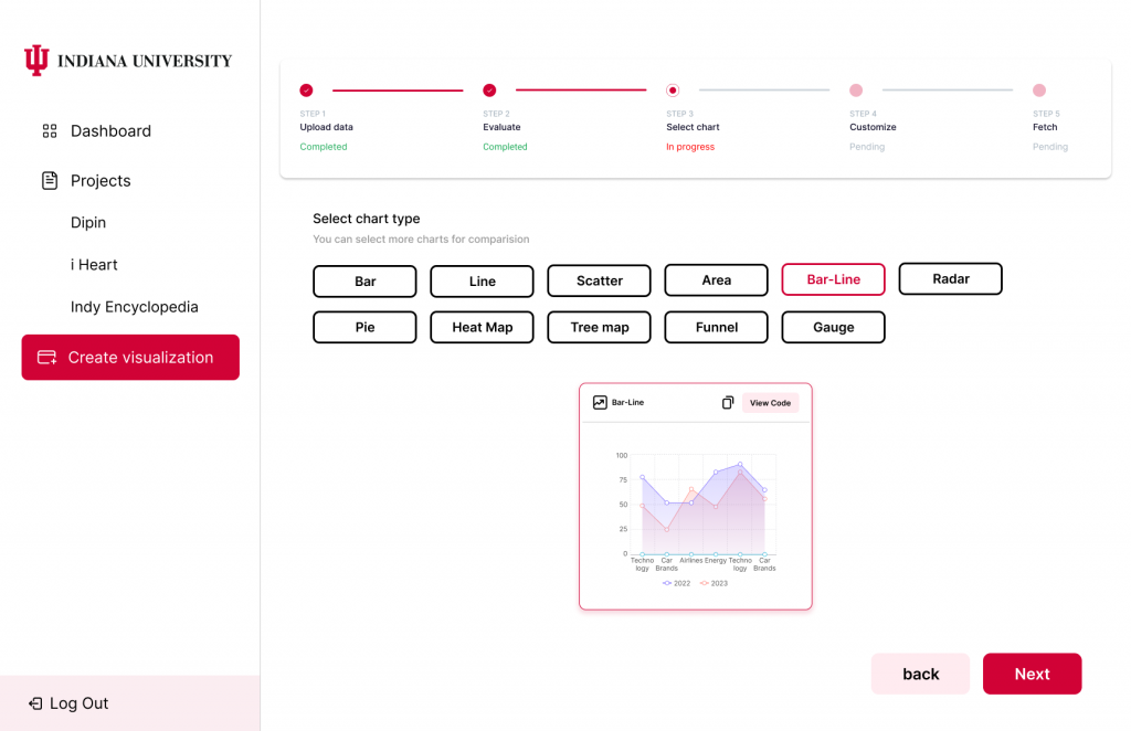
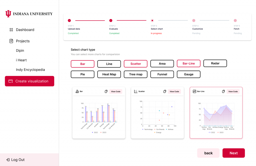
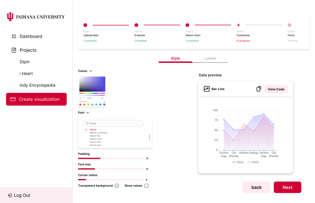
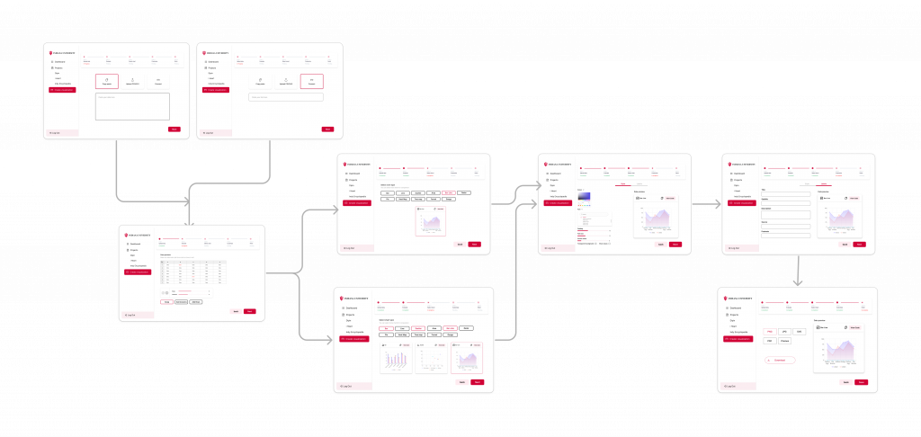
- Low-Fidelity (Lo-Fi) Flow Creation: A low-fidelity flow for the proposed visualization mechanism was developed, mapping out the core functionalities. This step focused on outlining the structure and workflow in a simplified and iterative manner to ensure clarity and usability.
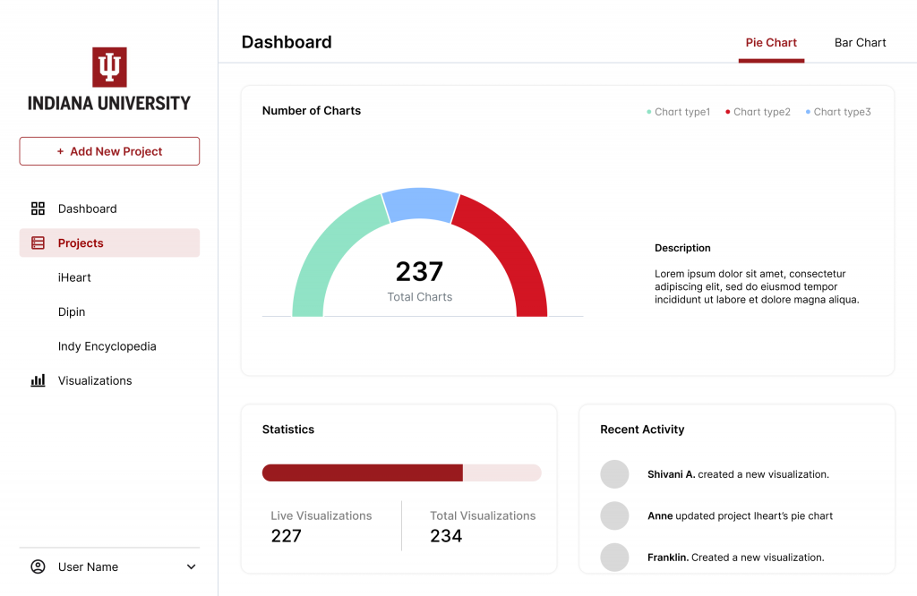
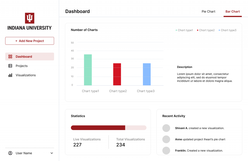
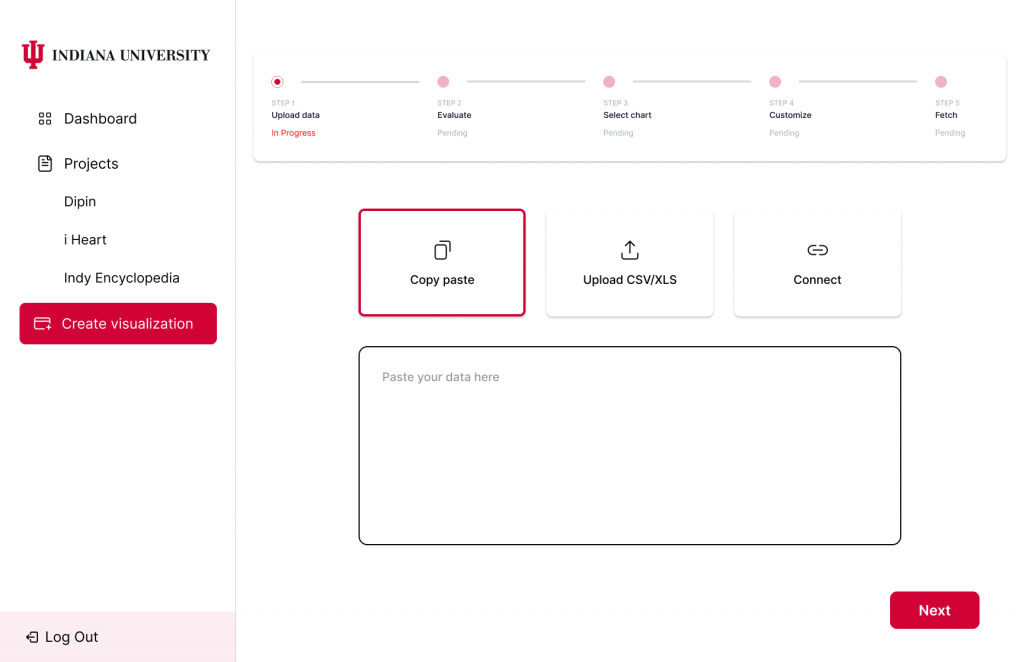
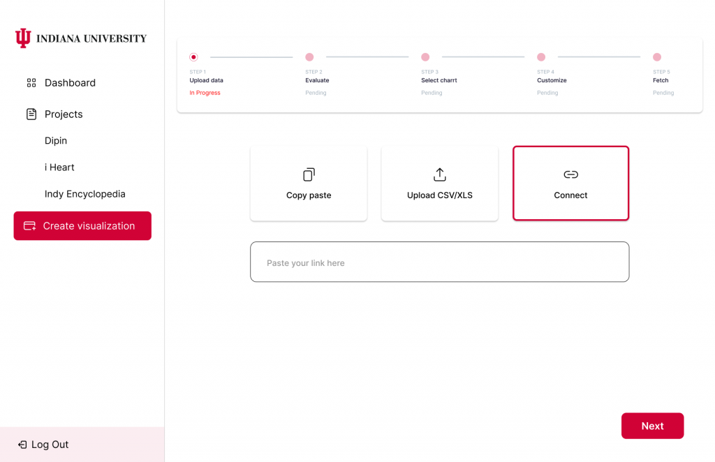
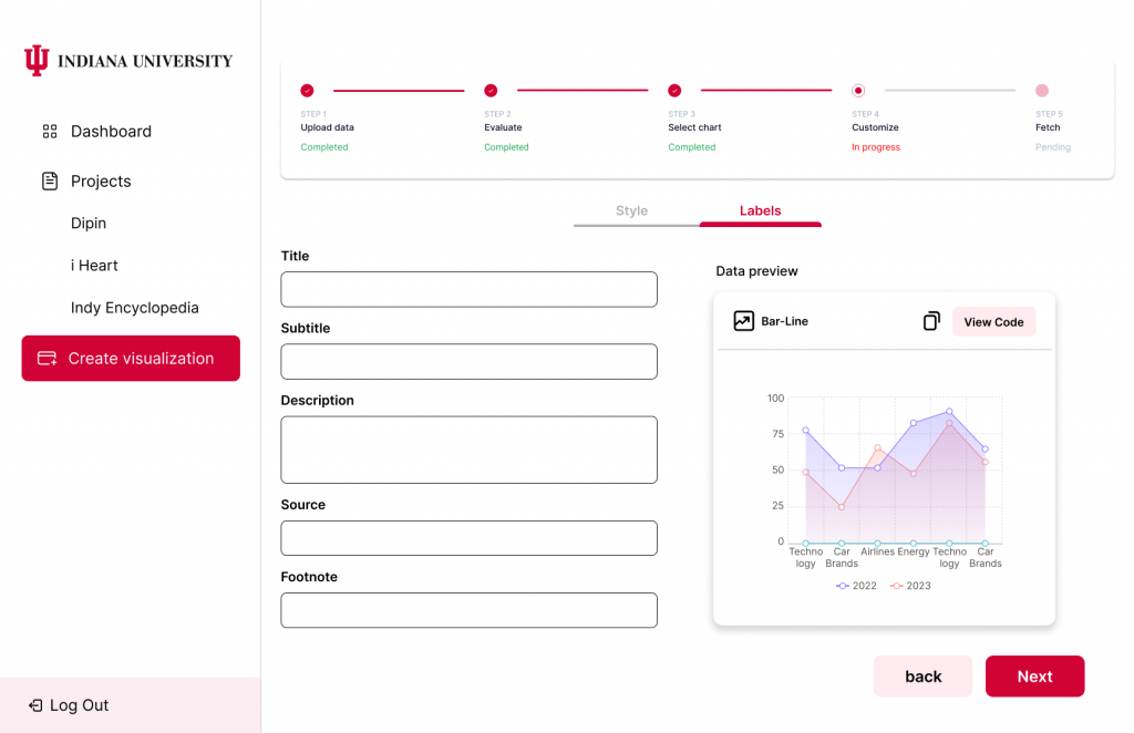
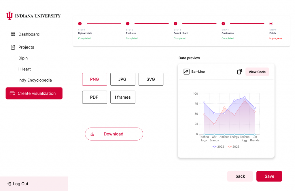
- High-Fidelity (Hi-Fi) Design Development: Building upon the Lo-Fi flow, detailed high-fidelity designs were created to represent the finalized visual and interactive elements of the tool. These designs served as a blueprint for the development process, ensuring a polished and user-centric solution.
By following this methodology, the project ensured a thorough and user-informed design process, paving the way for a robust and intuitive data visualization tool tailored to the Polis Center’s needs.
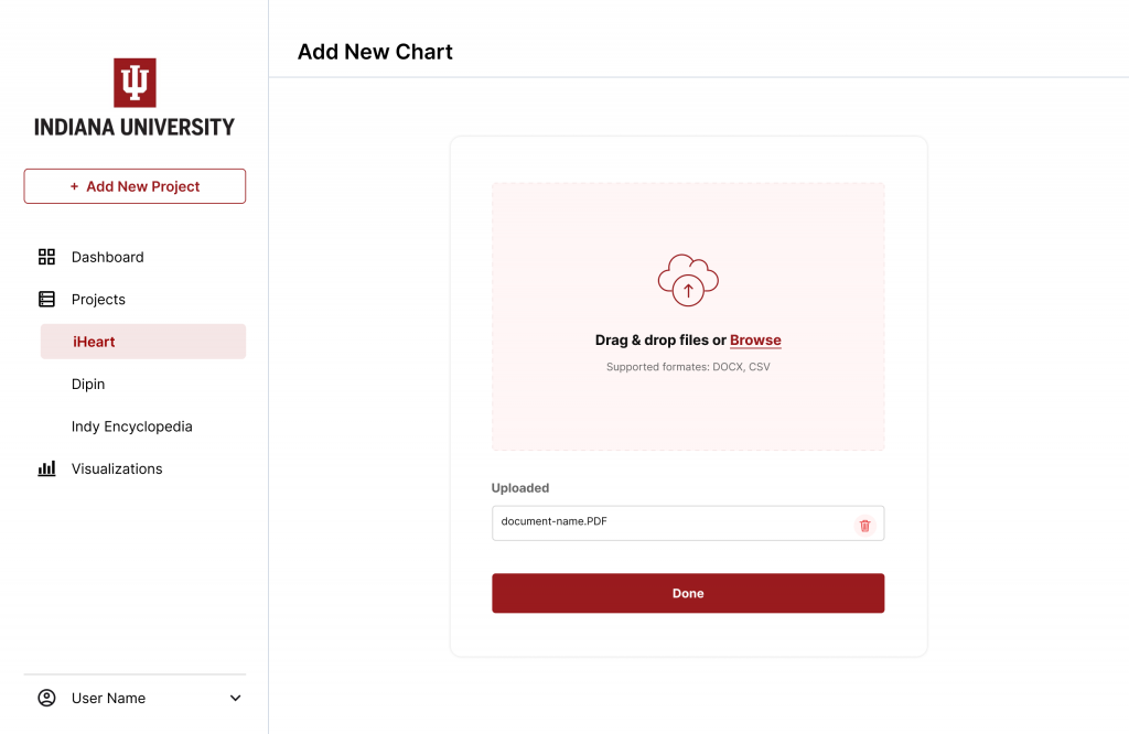
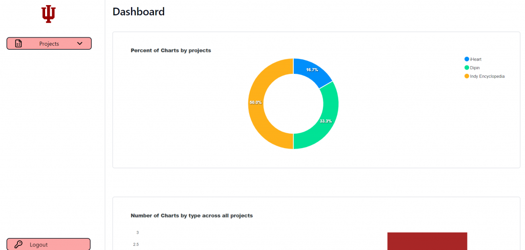
Heuristic Evaluation on Existing Polis Website
Objective: Evaluated usability based on Nielsen’s heuristics.
Key findings:
- Navigation issues due to inconsistent terminology (e.g., “Dashboard” vs. “Home”).
- Inconsistent color coding across graphs increases cognitive load.
- Redundant graphs presenting similar data affect readability and layout efficiency.
- Missing feedback on system status (e.g., unresponsive “Add Project” button).
- No clear instructions or feedback for file uploads, including supported types or size limits.
- Charts page fails to match data mentioned in the overview, causing user confusion.
Recommendations:
- Standardize terminology across the website to ensure consistent navigation (e.g., always use “Dashboard”).
- Use uniform color coding for graphs to improve user comprehension.
- Combine redundant graphs to simplify page layout and enhance readability.
- Implement clear system feedback for actions, especially when features are unavailable.
- Provide explicit instructions for file uploads, including supported formats and size limits.
- Ensure charts in the “Charts” page align with the overview or clearly indicate unavailable data.
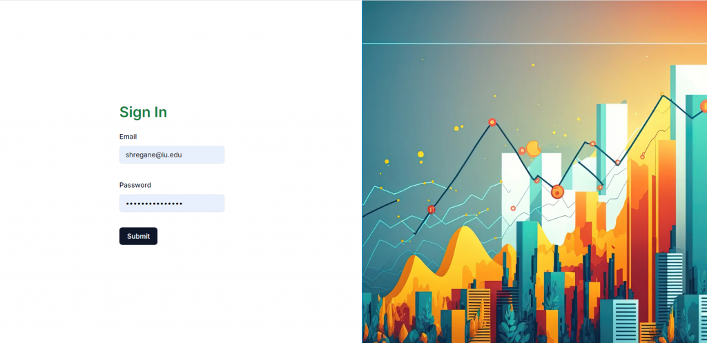
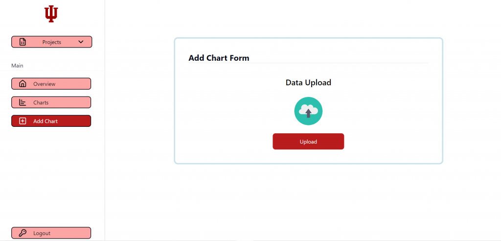
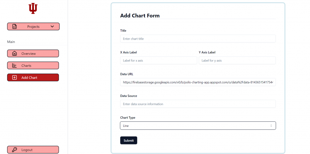
Heuristic Evaluation on Datawrapper Website
Objective: Evaluated usability based on Nielsen’s heuristics.
Key findings:
- High consistency and intuitive design using familiar terminology.
- Supports both novice and expert users with no-code solutions and customization options.
- Clean, minimalist aesthetic enhances focus and usability.
- Error prevention mechanisms and feedback are limited; vague error messages hinder recovery.
- Certain features are restricted in the free version, impacting usability for non-paying users.
- Data security concerns due to reliance on cloud-based storage for free versions.
- Issues with advanced customization, color changes, and column limitations.
Recommendations:
- Enhance error prevention by providing specific and actionable error messages.
- Expand free version functionality or provide clearer communication about limitations.
- Simplify advanced customization processes for non-technical users.
- Address data security concerns by offering more transparency or localized storage options.
- Allow greater flexibility in visual customizations, including better color options and column handling.
Lo-fi designs on visualizations creation flow:
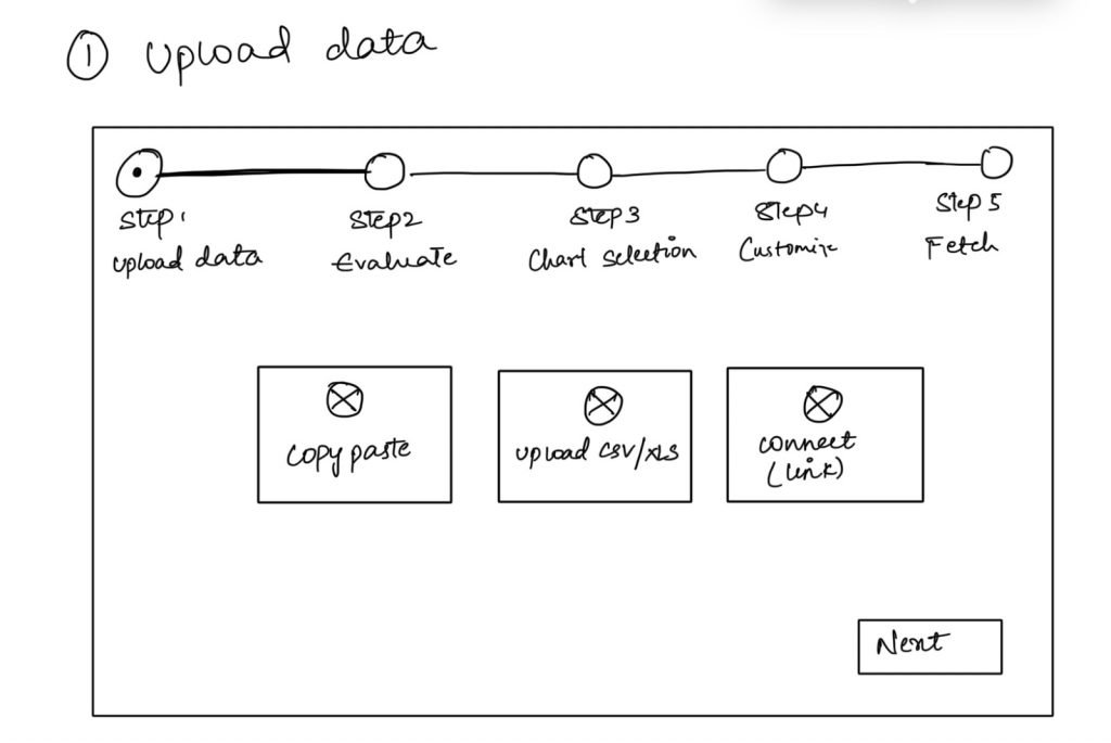
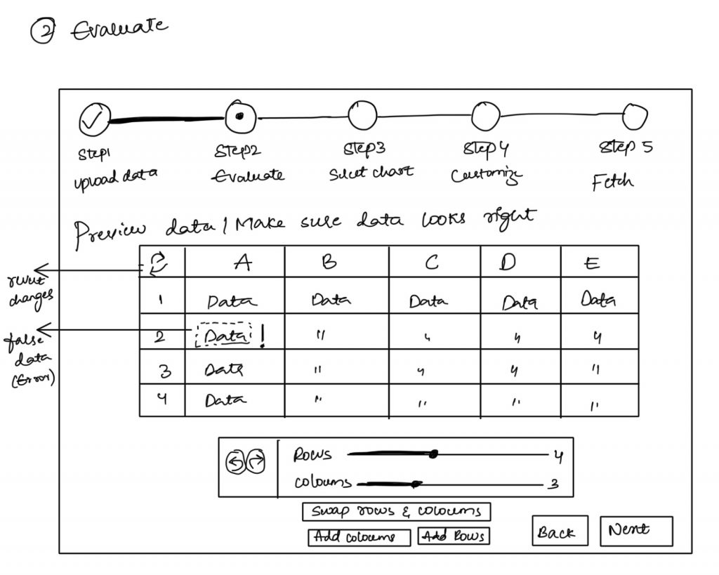
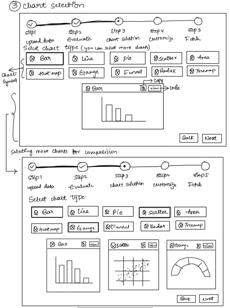
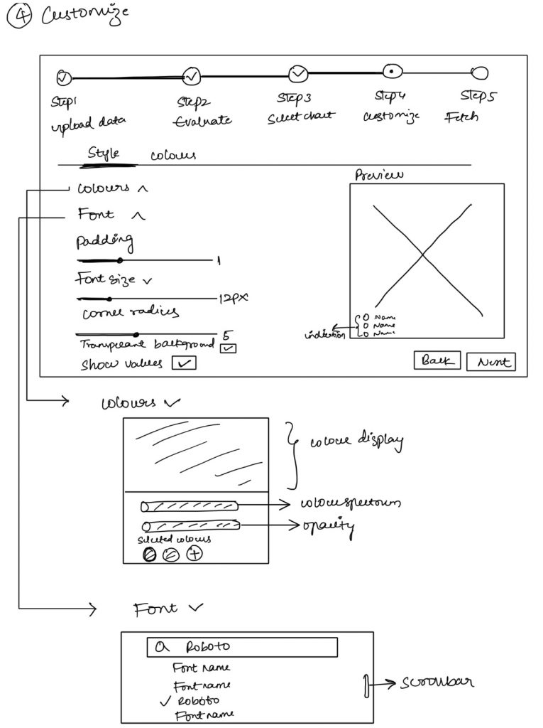
Hi-fi Designs on visualizations creation flow:
Design flow:
Team Members
Lead Data Analyst: Hasaranga Dilshan Jayathilake, Supraja Pericherla
Data Analyst: Sumedh Ajit Sonawane, Soumya Shanigarapu
UI/UX Researcher: Harshita Jakkidi, Shreya Ganesh
Web Developer: Hasaranga Dilshan Jayathilake, Harshita Jakkidi
Project Manager: Aakriti Bhandari