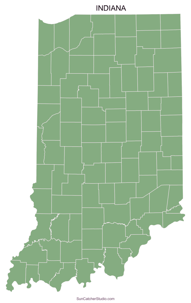
Social Deprivation Indices of Indiana Counties

Introduction to the topic
The Social Deprivation Index (SDI) is a powerful tool to address disparities rooted in social determinants of health (SDOH). By quantifying socio-economic deprivation across small geographic areas, the SDI serves as a critical measure to understand health inequities and to guide the allocation of healthcare resources. Originally developed by Butler et al. in 2012, SDI incorporates seven demographic characteristics derived from the American Community Survey (ACS). These characteristics reflect factors such as poverty, education, and housing, which collectively influence health outcomes. By using SDI, policymakers and healthcare providers can target interventions where they are most needed, advancing health equity and supporting the goals of better care, improved population health, and lower healthcare costs.
Objective:
The primary objective of this project is to analyze and visualize the Social Deprivation Index for Indiana counties using data from 2018 to 2022. The study aims to:
- Identify patterns of socio-economic disadvantage at the county level.
- Examine correlations between SDI and key factors such as poverty, unemployment, and population distribution.
- Provide a data-driven foundation for informed decision-making and resource allocation to address health disparities.
Methodology
1. API Connection:
Setting up the API connection
2. Choosing the data:
Selecting the required data tables
3. Formatting the data:Rounding off digits and calculating rank of the indicators
4. Calculating:
Using the formula given on the SDI website, calculating the SDI
Visuals of the findings
Indiana State Map with SDI Colors
This map illustrates the distribution of SDI across Indiana counties. Higher SDI values, represented by green colors, indicate greater socio-economic deprivation. This visualization enables stakeholders to pinpoint counties requiring focused intervention.
Heat Map for Poverty Level in Indiana Counties
This map highlights poverty levels by county, showcasing the percentage of individuals living below the federal poverty line. Counties with higher poverty rates are represented with more intense colors, providing insights into areas of economic need.
Heat Map for Unemployment in Indiana Counties
This heat map represents unemployment rates, reflecting the proportion of the population actively seeking work. This data provides a lens to understand labor market disparities across the state.
Heat Map for Population Distribution in Indiana Counties
This map visualizes population density, offering a spatial perspective on where residents are concentrated. It aids in contextualizing SDI by correlating deprivation with population distribution.

SUMMARY
The Social Deprivation Index provides an invaluable framework for addressing socio-economic inequities in health outcomes. This project’s analysis of Indiana counties from 2018–2022 reveals significant variations in SDI, poverty, unemployment, and population distribution. These visualizations offer actionable insights to inform healthcare policy and resource allocation. By leveraging the SDI, stakeholders can take critical steps toward mitigating health disparities and achieving equitable healthcare for all Indiana residents.
Team Members
| Name | Role |
|---|---|
| Hasaranga Dilshan Jayathilake | Lead Data Analyst & Project Manager |
| Supraja Pericherla | Lead Data Analyst |
| Bhushan Sitaram Shelke | Data Analyst |
| Shreya Reddy Kunchala | Data Analyst |
| Sreenidhi Jayakumar | UI/UX Designer |
| Narasimha Rohit Katta | Web Developer |